|
|
Pick a Color
Exhibitions Dates: September 19th - October 29th. 2022 at the Art Center Cooperative Gallery in San Marco. Visit 1225 Hendricks Ave. Questions call 904.233.9252.
Theme: Going monochromatic just for fun! “Chose A Color, Any Color” is an exhibition to encourage the artist to explore values and tones, any subject, any style this is your game. And yes, you may use black and white.
Reception and Award Ceremony: Oct 9th, 2022 - SUNDAY FROM 2-4 P.M.
The Art Center Cooperative, Inc will be hosting the reception both at our San Marco Gallery and online. The exhibition will be highlighted on our website with both an online gallery and an exhibition store with all artworks available for online purchase.
Pick a Color Gallery
Click on any item below to find out more about it. All pieces are for sale online.
SCROLL DOWN THE PAGE TO FIND OUT ABOUT THE WINNERS.
SCROLL DOWN THE PAGE TO FIND OUT ABOUT THE WINNERS.
Please scroll down the page to find out about the Judge and her comments on the winning pieces.
About the Show
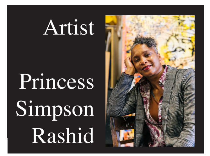
JUROR - PRINCESS RASHID, AMERICAN PAINTER, PRINTMAKER, BLOGGER & ART ACTIVIS
|
Princess Simpson Rashid is an American visual artist, poet, designer and fencer. She holds a Bachelor of Science degree in Physics from Georgia State University and worked as a nano-science researcher at Georgia Tech Research Institute (GTRI) as a Ronald E. McNair Scholar. She later studied painting and printmaking at The School of Plastic Arts and Design in Old San Juan, Puerto Rico.
Her current body of work explores the relationship between color, perception and symbolism. She investigates the role the brain plays in how we experience our environment and create our reality. Her focus is on the magic behind human creativity. |
Recently, Rashid completed an artist residency at the Jacksonville Museum of Science & History (MOSH) where she created a four-panel mural painting called the Wonder Wall. It has been installed as the signature piece in their Creation Station. The work synthesizes her research and ideas about the relationship between neuroscience, visual perception and creativity. Her design process placed special emphasis on the “doodle” and “squiggle” as important exploratory elements for idea generation, memory encoding and recall.
Her paintings and original prints have been exhibited in museums, art centers, galleries and alternative art spaces across the United States, including the Highpoint Center for Printmaking in Minneapolis, MN. She recently received a Purchase Award for work exhibited in the 2022 Extreme Pressure Biennial of American Prints exhibition at the CF Webber Gallery in Ocala, FL. Rashid has an upcoming solo exhibit at the Cummer Museum of Art & Gardens in their Concourse Gallery in complement to their upcoming Age of Armor exhibition.
Rashid is an active participant in her arts and cultural community. Recently she served as a member of the Kara Walker Exhibition Advisory Committee at the Museum of Contemporary Art and as a member of Augusta Savage Exhibition Advisory Committee at the Cummer Museum of Art & Gardens. She operates her studio practice within the CoRK Arts District in Jacksonville, FL.
To find out more about Princess Rashid visit her website at: Princess Rashid Fine Art
the Juror's Statement about the Show:
“We’ll have to learn to do more with less around here.” !!! -Ludwig Mies van der Rohe, minimalist architect Colors are so powerful. They possess strong emotive qualities and can grab the viewer’s attention. Sometimes that strength is enhanced by restraint. This exhibition encouraged the artist to restrain their palette by focusing on one color. By going monochromatic, the artist is freed to explore values and tones in any subject matter and style of their choosing.
Among the diverse submissions, I focused on images that used design as a device with specific use of negative space. A sense of texture was also a component of special interest to me. All of the accepted pieces had a strong graphic quality. But the most effective images managed to incorporate sufficient diversity of values. The four award winners had all the elements I was looking for—values, tone, design, texture, and concept.
Among the diverse submissions, I focused on images that used design as a device with specific use of negative space. A sense of texture was also a component of special interest to me. All of the accepted pieces had a strong graphic quality. But the most effective images managed to incorporate sufficient diversity of values. The four award winners had all the elements I was looking for—values, tone, design, texture, and concept.
AWARDS: FIRST, SECOND, THIRD & HONORABLE MENTION
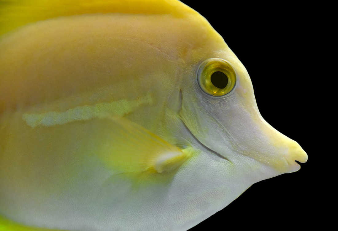
Best in Show - "Hello Yellow" by Mary Atwood:
|
The Best of Show/First Place award winner, “Hello Yellow” by Mary Atwood is a piece that I returned to again and again. I found the composition unique and somewhat daring. Great use of space and clarity. Crisp image, graphic nature and effective lighting make this piece shine. Yellow is not an easy color to work with in any medium. Atwood makes it sing here.
Mary is an artist member of TAC - to see more of her work go to her artist shop by clicking here. |
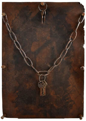
2nd Place - "Go Back" by Moises Ramos
3rd Place - "Ten" by Michelle Mohler
|
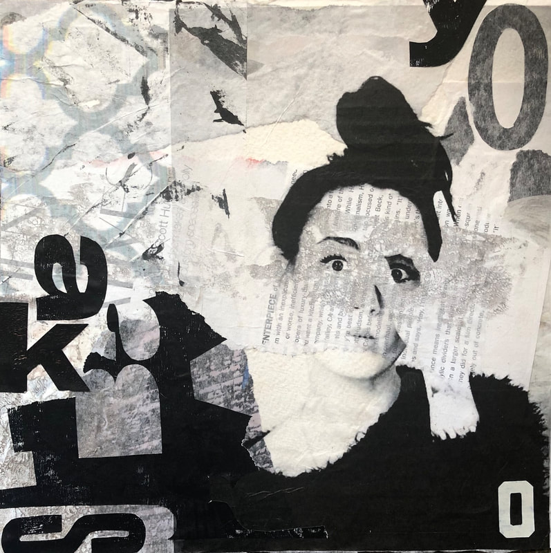
The Third Place award winner, “Ten” by Michelle Mohler is a strong composition that incorporates a playful use of text, size variation and directional energy. I was most impressed by Mohler’s ability to imply a sense of texture and grayscale with her limited palette. The tiny areas of colored paper residue seem to act as counterweights to the dominant figure. The restraint of the tinge of red and blue colors, I suspect from the paper fibers, was skillful. They draw the eye and balance the composition. Mohler was able to use material limitations as an effective compositional device.
|
Honorable Mention - "Apparition" by Kim Hurt
|
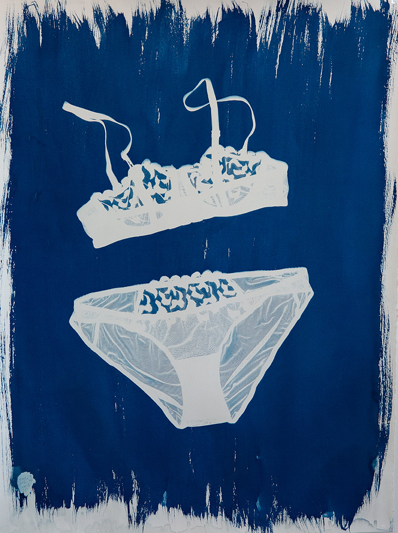
The Honorable Mention award winner, “Apparition” by Kim Hurt reads well both expressively and conceptually. As I narrowed down my selections this cyanotype kept drawing my attention. I was impressed by the concept behind the piece as well as the unconventional chosen technique. Blue is the color that is produced by this alternative photographic method. The choice behind making a blueprint was appropriate in making an apparition.
|
